アニメーション(ImplicitlyAnimatedWidget)
アニメーション(ImplicitlyAnimatedWidget)
今回はアニメーション(ImplicitlyAnimatedWidget)について解説していきます。
アニメーションを作成する方法として、AnimatedContainerを使った方法もあるのですが、他にも色々と簡単に作成できる方法が提供されています。
AnimatedContainerの解説はこちら
ImplicitlyAnimatedWidgetクラスを継承しているとAnimateControllerなどのような複雑な制御をせずにアニメーションを作成できます。
- AnimatedAlign
- AnimatedPadding
- AnimatedSize
- AnimatedDefaultTextStyle
- AnimatedOpacity
- AnimatedPhysicalModel
- AnimatedPositioned
- AnimatedPositionedDirectional
配置の変更(AnimatedAlign)
「AnimatedAlign」を使うことで子要素の配置を変更してアニメーションさせることができます。
AnimatedContainerのAlignmentでも同じ動きを作ることができます。
class _MainPageState extends State<MainPage> {

  Alignment _alg = Alignment.topLeft;

  void _onTap() => setState(() => _alg = Alignment.bottomRight);

  Widget build(BuildContext context) {
    return Scaffold(
      appBar: AppBar(
        title: const Text('AnimatedAlign'),
      ),
      body: AnimatedAlign(
        alignment: _alg,
        duration: Duration(seconds: 1),
        child: Container(
          width: 100,
          height: 100,
          color: Colors.blueAccent,
        ),
      ),
      floatingActionButton: FloatingActionButton(onPressed: _onTap),
    );
  }
}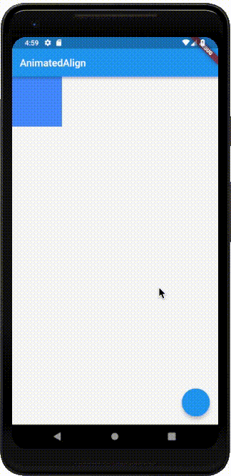
AnimatedAlignはalignmentで子要素の配置を変更します。
サンプルは、topLeftの位置から、bottomRightの位置へ斜めに移動しているのがわかると思います。
この時の、アニメーションの動き(Curve)や、時間(Duration)についてはAnimatedContainerで説明していますので、そちらを参照してください。
AnimatedPadding
「AnimatedPadding」を使うことでPaddingを変更してアニメーションさせることができます。
AnimatedContainerのPaddingでも同じ動きを作ることができます。
class _MainPageState extends State<MainPage> {

  double _padding = 50;

  void _onTap() => setState(() => _padding = 0);

  Widget build(BuildContext context) {
    return Scaffold(
      appBar: AppBar(
        title: const Text('AnimatedPadding'),
      ),
      body: Center(
        child: Container(
          color: Colors.orange,
          child: AnimatedPadding(
            padding: EdgeInsets.all(_padding),
            duration: Duration(seconds: 1),
            child: Container(
              width: 100,
              height: 100,
              color: Colors.blueAccent,
            ),
          ),
        ),
      ),
      floatingActionButton: FloatingActionButton(onPressed: _onTap),
    );
  }
}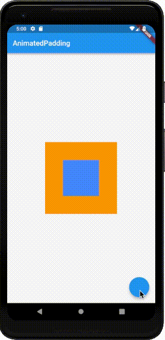
AnimatedPaddingはpaddingで余白を変更します。
サンプルは、Paddingを50から、0に変更しているので、オレンジ色の部分がなくなったのがわかると思います。
AnimatedSize
「AnimatedSize」を使うことでサイズの変更してアニメーションさせることができます。
AnimatedContainerのサイズ調整でも同じ動きを作ることができます。
画像などを子要素にすることもできるので、クリックすると画像が拡大されるようなアニメーションを作ることも可能です。
class _MainPageState extends State<MainPage> with SingleTickerProviderStateMixin {

  double _width = 50;

  void _onTap() => setState(() => _width = 100);

  Widget build(BuildContext context) {
    return Scaffold(
      appBar: AppBar(
        title: const Text('AnimatedSize'),
      ),
      body: Center(
        child: AnimatedSize(
          vsync: this,
          duration: Duration(seconds: 1),
          child: Container(
            width: _width,
            height: 100,
            color: Colors.blueAccent,
          ),
        ),
      ),
      floatingActionButton: FloatingActionButton(onPressed: _onTap),
    );
  }
}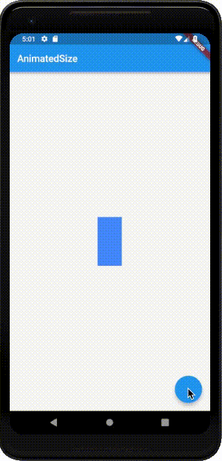
AnimatedSizeはwidthまたはheightの値を変更してアニメーションさせます。
サンプルは、widthを50から、100に変更しているので、横に大きくなり正方形に変わりました。
AnimatedDefaultTextStyle
「AnimatedDefaultTextStyle」を使うことでテキスト要素のアニメーションさせることができます。
テキストを目立たせたり動きのあるメッセージを作ることが可能です。
class _MainPageState extends State<MainPage> {

  TextStyle _style = TextStyle(color: Colors.blueAccent, fontSize: 30, fontWeight: FontWeight.w900);

  void _onTap() => setState(() => _style = TextStyle(color: Colors.black, fontSize: 20, fontWeight: FontWeight.w300));

  Widget build(BuildContext context) {
    return Scaffold(
      appBar: AppBar(
        title: const Text('AnimatedDefaultTextStyle'),
      ),
      body: Center(
        child: AnimatedDefaultTextStyle(
            style: _style,
            duration: Duration(seconds: 1),
            child:Text('AnimatedDefaultTextStyle')
        ),
      ),
      floatingActionButton: FloatingActionButton(onPressed: _onTap),
    );
  }
}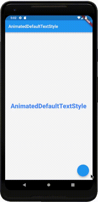
AnimatedDefaultTextStyleはstyleの値を変更してアニメーションさせます。
サンプルは、styleの「TextStyle」クラスの設定を変更することで、フォントのサイズや色、太さなどが変わっています。
AnimatedOpacity
「AnimatedOpacity」を使うことで色の濃さに対してのアニメーションさせることができます。
色の濃さをアニメーションすることで、フィードアウトやフィードインのようなアニメーションが簡単に作れます。
class _MainPageState extends State<MainPage> {

  double _opacity = 1.0;

  void _onTap() => setState(() => _opacity = 0.5);

  Widget build(BuildContext context) {
    return Scaffold(
      appBar: AppBar(
        title: const Text('AnimatedOpacity'),
      ),
      body: Center(
        child: AnimatedOpacity(
          opacity: _opacity,
          duration: Duration(seconds: 1),
          child: Container(
            width: 100,
            height: 100,
            color: Colors.blueAccent,
          ),
        ),
      ),
      floatingActionButton: FloatingActionButton(onPressed: _onTap),
    );
  }
}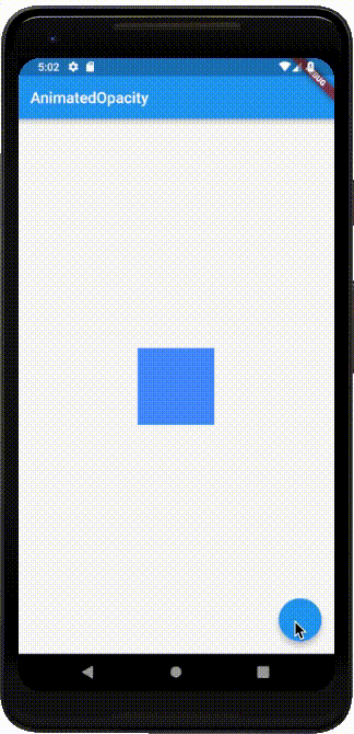
AnimatedOpacityはopacityの値を変更してアニメーションさせます。
サンプルは、opacityを1.0から0.5に変更することで、徐々に薄くなっていくアニメーションになっています。
AnimatedPhysicalModel
「AnimatedPhysicalModel」を使うことで影の濃さなどに対してのアニメーションさせることができます。
モーダルやボタンが浮き上がったり、沈み込むようなアニメーションを作ることができます。
class _MainPageState extends State<MainPage> {

  bool _isDisabled = true;

  void _onTap() => setState(() => _isDisabled = false);

  Widget build(BuildContext context) {
    return Scaffold(
      appBar: AppBar(
        title: const Text('AnimatedPhysicalModel'),
      ),
      body: Center(
        child: Padding(
          padding: const EdgeInsets.all(40),
          child: AnimatedPhysicalModel(
            duration: Duration(seconds: 1),
            child: Container(
              width: 100,
              height: 100
            ),
            borderRadius: _isDisabled ? BorderRadius.all(Radius.zero) : BorderRadius.all(Radius.circular(10.0)),
            elevation: _isDisabled ? 10 : 20,
            color: _isDisabled ? Colors.orange : Colors.deepOrange,
            animateColor: true,
            shape: BoxShape.rectangle,
            shadowColor: Colors.black,
            curve: Curves.fastOutSlowIn,
          ),
        ),
      ),
      floatingActionButton: FloatingActionButton(onPressed: _onTap),
    );
  }
}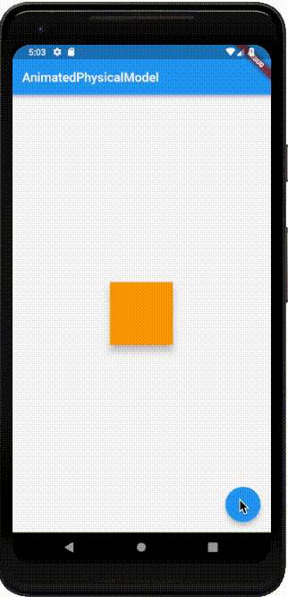
AnimatedPhysicalModelは borderRadiusとelevationをアニメーションさせることができます。shapeはアニメーションしません。animateColorをtrueにすることで、色もアニメーションさせることができます。
サンプルは、 borderRadiusとelevation、colorを変更することで、浮き上がって色が代わり角が取れるアニメーションになっています。
AnimatedPositioned
「AnimatedPositioned」を使うことで位置を変化をアニメーションさせることができます。
「AnimatedAlign」との違いは、四辺からの距離の指定で細かく移動させることができる点です。
class _MainPageState extends State<MainPage> {

  double _top = 0;

  void _onTap() => setState(() => _top = 100);

  Widget build(BuildContext context) {
    return Scaffold(
      appBar: AppBar(
        title: const Text('AnimatedPositioned'),
      ),
      body: Center(
        child: Stack(
          children: <Widget>[
            AnimatedPositioned(
              top: _top,
              left: 0,
              duration: Duration(seconds: 1),
              child: Container(
                width: 100,
                height: 100,
                color: Colors.blueAccent,
              ),
            ),
          ]
        )
      ),
      floatingActionButton: FloatingActionButton(onPressed: _onTap),
    );
  }
}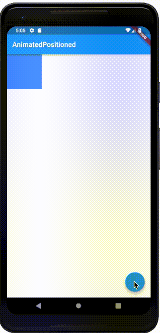
AnimatedPositionedは以下の値を変更してアニメーションさせます。
top上辺からの距離bottom下辺からの距離left左辺からの距離right右辺からの距離
必ずStackの子要素である必要があります。
サンプルは、topを0から100に変更することで、上から下へ移動するアニメーションになっています。
AnimatedPositionedDirectional
「AnimatedPositionedDirectional」を使うことで位置を変化をアニメーションさせることができます。
「AnimatedPositioned」との違いは、ほとんどありません。
違いとしては、横方向への動きがleft、rightだったものが、start、endに変わっています。
これは、多言語化意識したときに特に有用な要素です。
例えばアラビア語のように文字の読む方向が、右から左になっているので、通常とは逆にstartは右、endは左になります。
このように国によって右から左、左から右など見る順が違うので、Directionalityの設定で、方向を容易に制御できるようになります。
class _MainPageState extends State<MainPage> {

  double _start = 0;

  void _onTap() => setState(() => _start = 100);

  Widget build(BuildContext context) {
    return Scaffold(
      appBar: AppBar(
        title: const Text('AnimatedPositionedDirectional'),
      ),
      body: Center(
        child: Stack(
          children: <Widget>[
            Directionality(
              textDirection: TextDirection.rtl,
              child: AnimatedPositionedDirectional(
                top: 0,
                start: _start,
                duration: Duration(seconds: 1),
                child: Container(
                  width: 100,
                  height: 100,
                  color: Colors.blueAccent,
                ),
              ),
            )
          ]
        )
      ),
      floatingActionButton: FloatingActionButton(onPressed: _onTap),
    );
  }
}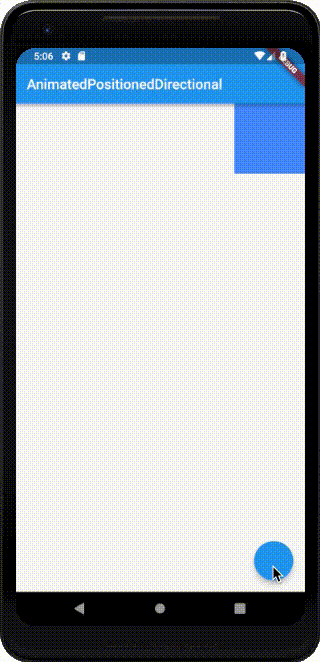
AnimatedPositionedDirectionalは以下の値を変更してアニメーションさせます。
top上辺からの距離bottom下辺からの距離start開始位置からの距離end終了位置からの距離
必ずStackの子要素である必要があります。
サンプルは、startを0から100に変更することで、開始位置から、終了位置へ移動するアニメーションになっています。
サンプルは、Directionality.rtl(右から左)となっているので、右を0として左側へ100移動しています。