ボタン
Button
ボタンには色々な種類があり、それぞれ特徴があり必要な要件に応じて使い分けてみて利用してください。
各種ボタンウィジェットによってイベントの違いなどもあるので色々試してみてください。
FlatButton
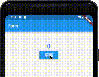
「FlatButton」は一番シンプルなボタンになります。
class MyApp extends StatelessWidget {
@override
Widget build(BuildContext context) {
return MaterialApp(
title: 'Form',
home: Scaffold(
appBar: AppBar(
title: Text('Form'),
),
body: Center(
child: ChangeForm(),
),
),
);
}
}
class ChangeForm extends StatefulWidget {
@override
_ChangeFormState createState() => _ChangeFormState();
}
class _ChangeFormState extends State<ChangeForm> {
int _count = 0;
void _handlePressed() {
setState(() {
_count++;
});
}
Widget build(BuildContext context) {
return Container(
padding: const EdgeInsets.all(50.0),
child: Column(
children: <Widget>[
Text(
"$_count",
style: TextStyle(
color:Colors.blueAccent,
fontSize: 30.0,
fontWeight: FontWeight.w500
),
),
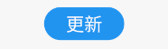
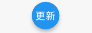
FlatButton(
onPressed: _handlePressed,
color: Colors.blue,
child: Text(
'更新',
style: TextStyle(
color:Colors.white,
fontSize: 20.0
),
),
)
],
)
);
}
}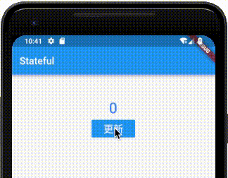
今回の例ではボタンをクリックするとカウントアップするようにしています。onPressedでクリック時の処理を実装しています。
FlatButton(
  onPressed: _handlePressed,
  color: Colors.blue,
  shape: RoundedRectangleBorder(
      borderRadius: BorderRadius.circular(20.0)
  ),
  child: Text(
    '更新',
    style: TextStyle(
        color:Colors.white,
        fontSize: 20.0
    ),
  ),
)
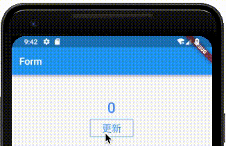
shapeを指定することでボタンの角を丸くした、角丸ボタンも作成できます。BorderRadius.circularを変更して好きに角を調整してください。
角丸の調整は他のボタンでも利用できるので必要に応じて調整してください。
RaisedButton
RaiseButtonは立体的なボタンを作成したいときに利用します。
RaisedButton(
  onPressed: _handlePressed,
  color: Colors.blue,
  child: const Text(
    '更新',
    style: TextStyle(
        color:Colors.white,
        fontSize: 20.0
    ),),
)
FlatButtonクラスとほとんど同じですが、立体的に見える動作をします。
OutlineButton
OutlineButtonは外側に枠線が付いているボタンになります。
OutlineButton(
  onPressed: _handlePressed,
  borderSide: BorderSide(color: Colors.blue),
  child: const Text(
    '更新',
    style: TextStyle(
        color:Colors.blue,
        fontSize: 20.0
    ),
  ),
)
必須ではないですが、borderSideに色を指定して枠線が見えるようにすると、アウトライン表示されたボタンになります。
IconButton
「IconButton」はアイコンをボタンにするときに利用します。
IconButton(
  iconSize: 100,
  onPressed: _handlePressed,
  color: Colors.blue,
  icon: Icon(Icons.add_circle_outline),
)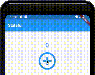
このようにアイコンボタンを作成できます。
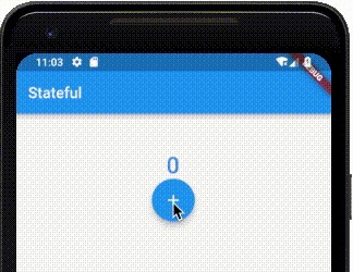
FloatingActionButton
「FloatingActionButton」はGmailアプリなどで見るような丸ボタンを簡単に作れます。
FloatingActionButton(
  onPressed: _handlePressed,
  backgroundColor: Colors.blue,
  child: Icon(Icons.add)
)
childには文字の設定もできるので、このような表現も可能です。
FloatingActionButton(
  onPressed: _handlePressed,
  backgroundColor: Colors.blue,
  child: const Text(
    '更新',
    style: TextStyle(
        color:Colors.white,
        fontSize: 20.0
    ),
  ),
)
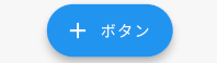
このままだと不恰好なので、もう少し「FloatingActionButton」を横長にしたいという場合は、FloatingActionButton.extendedを使ってください。
FloatingActionButton.extended(
  onPressed: _handlePressed,
  backgroundColor: Colors.blue,
  icon: Icon(Icons.add),
  label: const Text('ボタン'),
)
PopupMenuButton
「PopupMenuButton」は、メニューボタンを作成することができます。
PopupMenuButton<String>(
  onSelected: _handleChange,
  itemBuilder: (BuildContext context) => <PopupMenuEntry<String>>[
    const PopupMenuItem<String>(
      value: "1",
      child: Text('選択1'),
    ),
    const PopupMenuItem<String>(
      value: "2",
      child: Text('選択2'),
    ),
    const PopupMenuItem<String>(
      value: "3",
      child: Text('選択3'),
    ),
    const PopupMenuItem<String>(
      value: "4",
      child: Text('選択4'),
    ),
  ],
),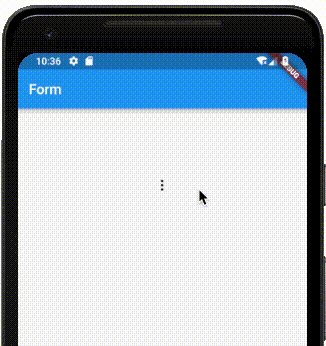
このように一般的なメニューボタンができました。
メニューから各種操作をする場合は、onSelectedでvalueに設定した値が受け取れるので、値を参照して操作してください。valueはジェネリクスで定義しているので、String以外にもenumを含む色々な型を利用できます。
DropdownButton
「DropdownButton」はリストを表示することができるボタンになります。
class _ChangeFormState extends State<ChangeForm> {

  String _defaultValue = 'りんご';
  List<String> _list = <String>['りんご', 'オレンジ', 'みかん', 'ぶどう'];
  String _text = '';

  void _handleChange(String newValue) {
    setState(() {
      _text = newValue;
      _defaultValue = newValue;
    });
  }

  Widget build(BuildContext context) {
    return Container(
        padding: const EdgeInsets.all(50.0),
        child: Column(
          children: <Widget>[
            Text(
              "$_text",
              style: TextStyle(
                  color:Colors.blueAccent,
                  fontSize: 30.0,
                  fontWeight: FontWeight.w500
              ),
            ),
            DropdownButton<String>(
              value: _defaultValue,
              onChanged: _handleChange,
              items: _list.map<DropdownMenuItem<String>>((String value) {
                return DropdownMenuItem<String>(
                  value: value,
                  child: Text(value),
                );
              }).toList(),
            ),
          ],
        )
    );
  }
}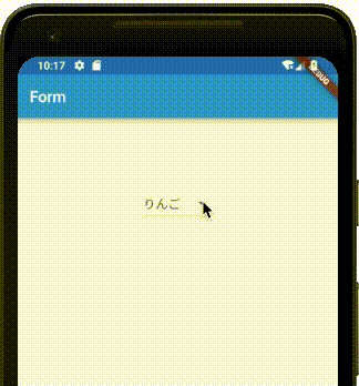
このようにリスト表示することができます。ドロップダウンが閉じた状態で選択内容を表示したいときはvalueに対して値を設定してください。
参考
FlatButton
RaisedButton
OutlineButton
IconButton
FloatingActionButton
PopupMenuButton
DropdownButton