ラジオボタン
Radio
ラジオはOnとOffの切り替えを行うことができます。
色の変更や、ListTileを使ったレイアウトなどがあるので、色々試してみてください。
Radio
「Radio」はWebページでおなじみのラジオボタンと同じものを作成することができます。
class _ChangeFormState extends State<ChangeForm> {

  String _type = '';

  void _handleRadio(String e) => setState(() {_type = e;});

  IconData _changeIcon(String e) {
    IconData icon = null;
    switch (e) {
      case 'thumb_up':
        icon = Icons.thumb_up;
        break;
      case 'favorite':
        icon = Icons.favorite;
        break;
      default:
        icon = Icons.thumb_up;
    }
    return icon;
  }

  Widget build(BuildContext context) {
    return Container(
      padding: const EdgeInsets.all(50.0),
      child: Column(
        children: <Widget>[
          Center(
            child: new Icon(
              _changeIcon(_type),
              color: Colors.orange[700],
              size: 100.0,
            ),
          ),
          new Radio(
            activeColor: Colors.blue,
            value: 'thumb_up',
            groupValue: _type,
            onChanged: _handleRadio,
          ),
          new Radio(
            activeColor: Colors.orange,
            value: 'favorite',
            groupValue: _type,
            onChanged: _handleRadio,
          ),
        ],
      )
    );
  }
}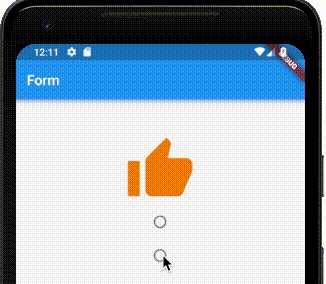
valueはラジオボタンの値です。groupValueは同じラジオボタンとして動作する「Radio」の値です。activeColorはラジオがOnになっている時の見た目です。onChangedはラジオボタンの値が変更された時に動作します。
RadioListTile
「RadioListTile」は「ListTile」の一種で、標準的なレイアウトを提供してくれます。
children: <Widget>[
  Center(
    child: new Icon(
      _changeIcon(_type),
      color: Colors.orange[700],
      size: 100.0,
    ),
  ),
  new RadioListTile(
    secondary: Icon(Icons.thumb_up),
    activeColor: Colors.blue,
    controlAffinity: ListTileControlAffinity.trailing,
    title: Text('Good'),
    subtitle: Text('Goodアイコンの表示'),
    value: 'thumb_up',
    groupValue: _type,
    onChanged: _handleRadio,
  ),
  new RadioListTile(
    secondary: Icon(Icons.favorite),
    activeColor: Colors.orange,
    controlAffinity: ListTileControlAffinity.trailing,
    title: Text('Favorite'),
    subtitle: Text('Favoriteアイコンの表示'),
    value: 'favorite',
    groupValue: _type,
    onChanged: _handleRadio,
  ),
],
このように、綺麗なレイアウトが可能です。
titleはラジオボタンのタイトルsubtitleはラジオボタンのサブタイトルsecondaryはアイコンなどをつけたい場合に利用してください。controlAffinityではラジオボタンの配置を変更できます。ListTileControlAffinity.leadingは先頭にラジオボタンを持ってきます。ListTileControlAffinity.trailingは末尾にラジオボタンを持ってきます。ListTileControlAffinity.platformは実行しているプラットフォームに対して一般的な配置にラジオボタンを持ってきます。