スイッチ
Switch
スイッチはOnとOffの切り替えを行うことができます。
色の変更や、ListTileを使ったレイアウトなどがあるので、色々試してみてください。
Switch
「Switch」はWebページでおなじみのスイッチトグルと同じものを作成することができます。
class _ChangeFormState extends State<ChangeForm> {

  bool _active = false;

  void _changeSwitch(bool e) => setState(() => _active = e);

  Widget build(BuildContext context) {
    return Container(
      padding: const EdgeInsets.all(50.0),
      child: Column(
        children: <Widget>[
          Center(
            child: new Icon(
              Icons.thumb_up,
              color: _active ? Colors.orange[700] : Colors.grey[500],
              size: 100.0,
            ),
          ),
          new Switch(
            value: _active,
            activeColor: Colors.orange,
            activeTrackColor: Colors.red,
            inactiveThumbColor: Colors.blue,
            inactiveTrackColor: Colors.green,
            onChanged: _changeSwitch,
          )
        ],
      )
    );
  }
}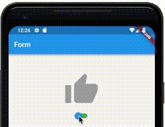
activeColorはスイッチが選択状態になっている時の下地の色activeTrackColorはスイッチが選択状態になっている時のトラッカーの色inactiveColorはスイッチが未選択状態になっている時の下地の色inactiveThumbColorはスイッチが未選択状態になっている時のトラッカーの色onChangedは値を変更した時に動作する。
SwitchListTile
「SwitchListTile」は「ListTile」の一種で、標準的なレイアウトを提供してくれます。
  Widget build(BuildContext context) {
    return Container(padding: const EdgeInsets.all(10.0),
      child: Column(
        children: <Widget>[
          new SwitchListTile(
            value: _active,
            activeColor: Colors.orange,
            activeTrackColor: Colors.red,
            inactiveThumbColor: Colors.blue,
            inactiveTrackColor: Colors.grey,
            secondary: new Icon(
              Icons.thumb_up,
              color: _active ? Colors.orange[700] : Colors.grey[500],
              size: 50.0,
            ),
            title: Text('タイトル'),
            subtitle: Text('サブタイトル'),
            onChanged: _changeSwitch,
          )
        ],
      )
    );
  }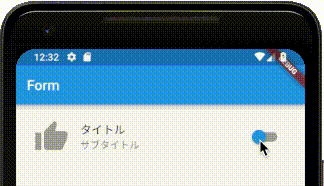
titleはスイッチトグルのタイトルsubtitleはスイッチトグルのサブタイトルsecondaryはアイコンなどをつけたい場合に利用してください。
スイッチを作成する時にSwitchListTile.adaptiveを使って作成することも可能ですが、こちらはiOS向けのデザインを提供するために使います。SwitchListTile.adaptiveを利用すると、iOS側ではいくつかの要素が使えなくなるので注意が必要です。