Columns & Row
Column & Row
ColumnとRowはその名の通り、行と列を制御します。
一つずつみていきましょう。
Row
class MyApp extends StatelessWidget {
  @override
  Widget build(BuildContext context) {
    return MaterialApp(
      title: 'Column & Row',
      home: Container(
        child: Center(
          child: Row(
            children: <Widget>[
              Container( color: Colors.blue, width: 100, height:100 ),
              Container( color: Colors.red, width: 100, height:100 ),
            ],
          ),
        ),
      ),
    );
  }
}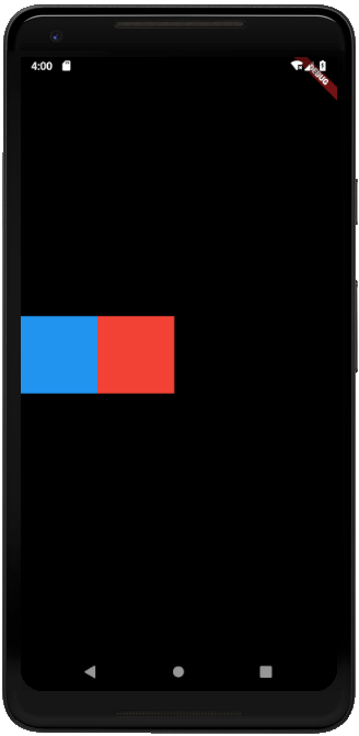
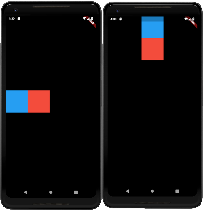
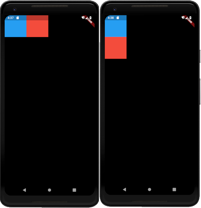
要素の横並びは以下のようにRowクラスに対してウィジェットのリストを持つことで実現できます。
child: Row(
  children: <Widget>[
    Container( color: Colors.blue, width: 100, height:100 ),
    Container( color: Colors.red, width: 100, height:100 ),
  ],
),
Column
class MyApp extends StatelessWidget {
  @override
  Widget build(BuildContext context) {
    return MaterialApp(
      title: 'Column & Row',
      home: Container(
        child: Center(
          child: Column(
            children: <Widget>[
              Container( color: Colors.blue, width: 100, height:100 ),
              Container( color: Colors.red, width: 100, height:100 ),
            ],
          ),
        ),
      ),
    );
  }
}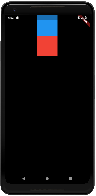
要素の縦並びは以下のようにColumnクラスに対してウィジェットのリストを持つことで実現できます。
child: Column(
  children: <Widget>[
    Container( color: Colors.blue, width: 100, height:100 ),
    Container( color: Colors.red, width: 100, height:100 ),
  ],
),
入れ子
ColumnとRowは入れ子構造にすることができます。
return MaterialApp(
  title: 'Column & Row',
  home: Container(
    child: Row(
      children: <Widget>[
        Column(
          children: <Widget>[
            Container( color: Colors.blue, width: 100, height:100 ),
            Container( color: Colors.red, width: 100, height:100 ),
          ],
        ),
        Column(
          children: <Widget>[
            Container( color: Colors.green, width: 100, height:100 ),
            Container( color: Colors.orange, width: 100, height:100 ),
          ],
        ),
      ],
    ),
  ),
);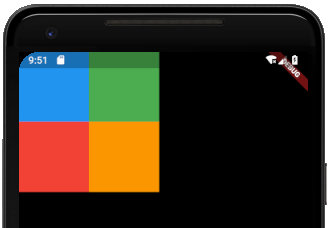
このように入れ子構造を作ることによって、行列を自在に組み合わせてレイアウトが作成できます。
配置
これで、行と列が使えるようになりましたが、これだけでは不十分です。
レイアウトをしていく中で、位置調整は大事な要素です。
ColumnとRowの位置調整で大事になる要素はmainAxisAlignmentとcrossAxisAlignmentです。
Containerの説明でもしましたAlignmentと同じで、位置の調整が可能です。
ですがもともと、行と列という並び順を持っているため、位置調整が少々特殊になっています。

図で示す通り、ColumnかRowかによってmainAxisAlignmentとcrossAxisAlignmentの位置調整の方向が変わります。
名称を読めばわかることですが、Column,Rowが伸びる方向をmainとして、それと直角に交わる方向をcrossとして位置調整していると覚えておきましょう。
実際にレイアウトしたものは以下になります。
MinAxisAlignment
ColumnとRowをそれぞれMainAxisAlignment.startで並べると以下のようになります。
return MaterialApp(
  title: 'Column & Row',
  home: Container(
    child: Column(
      mainAxisAlignment: MainAxisAlignment.start,
      children: <Widget>[
        Container( color: Colors.blue, width: 100, height:100 ),
        Container( color: Colors.red, width: 100, height:100 ),
      ],
    ),
  ),
);
return MaterialApp(
title: 'Column & Row',
home: Container(
child: Row(
mainAxisAlignment: MainAxisAlignment.start,
children: <Widget>[
Container( color: Colors.blue, width: 100, height:100 ),
Container( color: Colors.red, width: 100, height:100 ),
],
),
),
);
MainAxisAlignmentの基本の位置調整は以下の3種類です。
| start | center | end |
CrossAxisAlignment
ColumnとRowをそれぞれCrossAxisAlignment.startで並べると以下のようになります。
return MaterialApp(
  title: 'Column & Row',
  home: Container(
    child: Column(
      crossAxisAlignment: CrossAxisAlignment.start,
      children: <Widget>[
        Container( color: Colors.blue, width: 100, height:100 ),
        Container( color: Colors.red, width: 100, height:100 ),
      ],
    ),
  ),
);
return MaterialApp(
title: 'Column & Row',
home: Container(
child: Row(
crossAxisAlignment: CrossAxisAlignment.start,
children: <Widget>[
Container( color: Colors.blue, width: 100, height:100 ),
Container( color: Colors.red, width: 100, height:100 ),
],
),
),
);
CrossAxisAlignmentの基本の位置調整はMainAxisAlignmentと同じで以下の3種類です。
| start | center | end |